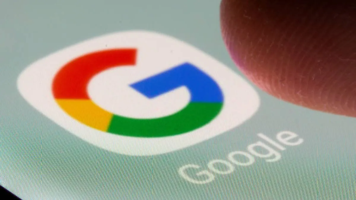
Google has updated its logo for the first time in 10 years! The well-known 'G' icon has a new look with changes to its colours. Instead of being split into four separate colors, the new design features a smooth blend where red flows into yellow, yellow into green, and green into blue. This makes the icon look even more vibrant and colorful. You can already find this updated icon in the Google Search app for iOS after a recent update. It was also rolled out for Android users on Monday with the latest version of the Google app.
The last time Google refreshed its icon was on September 1, 2015, when it switched to a modern font called Product Sans. That redesign changed the ‘G’ from a lowercase white letter on a blue background to the round logo we’ve become accustomed to over the past decade.
As for the main Google logo, it seems it hasn’t changed this time, and it's still uncertain if any other product logos will be updated.

Meanwhile, according to a report from Android Authority, Google is getting ready to give Android 16 a fresh new look. The update will feature a redesigned Quick Settings panel, which is the menu you see when you swipe down from the top of your screen. This panel will have a blurred background and adjustable tiles, making it more user-friendly, along with new buttons that allow you to turn Wi-Fi and Bluetooth on and off with just one tap.
In addition, the brightness slider, which you use to adjust your screen’s brightness, will have a stylish new design and more options for customisation. The icons in the status bar, where you see notifications and system alerts, are also being updated. For example, the icons for Wi-Fi and mobile data will be separated, and the airplane mode and 5G symbols will stand out more with bolder designs. The battery icon is set to become more dynamic, changing to green when your phone is charging and turning red when the battery is running low.
ALSO READ: Samsung Galaxy S25 Edge available for pre-order starting at Rs 1,09,999 with benefits worth Rs 12000
